1.In what ways does your media product use, develop or challenge forms and conventions of real media products?
Throughout this project I have both used and challenged the conventions of real media products.
My Video: One convention that I used in my music video was the element of editing my shots to the beat of the song or at an obvious change in the song (a point in which he started to sing, or the tempo changed, etc) Not only did I try to edit my shots to the beat but I also tried to reflect my clips to the tempo of the song. For Example, when the song got faster and more upbeat I chose to increase the speed of my video clips and put them into fast forward as well as using clips that were busy and of us being quite hyper and exciting, and then when the song slowed down again, I made my clips slow down and I used clips that were much less busy. A good example of this in my video is between 2:33 (where the song is slow and my clip is quite slow) and then at 2:40 the song and the beat picks up and at this point Patrick tries to stick the tape to my face his movements are very fast. Then this continues onto the next clip where the music is fast and so I sped up the clip into fast forward of us making pancakes. Another good example is at 3:22 where the music is very fast and I use lots of short and fast forward clips to reflect this and then at roughly 3:25 the music slows down and so I made the end of the current clip slow and the next clip (where the music continues to slow down) is a very slow clip of us kissing. Something that challenges conventions of a music video, is that fact that all of my editing (bar coming into the first shot and going out of the last shot where I used fades) all of my editing between the shorts are clear/straight cuts. I do not use any effects such as fades or blends etc. I did this on purpose as I felt that it looked a lot neater and clean. I also think that it added to the idea of a 'video diary' kind of video with how my video is clearly filmed by myself about myself.
During my research I found lots of music videos from all genre's that used these conventions, a good examples of a video that edits to the beat of the song and the tempo is Free - Rudimental ft. Emeli Sande
Another convention that I used was the idea of trying to make the audience feel like they are apart of the music video, and give them something to relate too. I did this by using handheld for parts of my video, and by making it deliberately obvious that it was filmed by myself or by Patrick.
A music video that has strong elements of this convention is Calving Harris - I Need Your Love ft. Ellie Goulding
Although my intentions behind this was a real convention, the use of actual hand held camera is challenging the normal conventions. However, I believe that it gave my video more of a realistic view on my characters and allowed the viewers to relate to my video because it is more realistic and it added to the idea of my theme of 'anyone can fall in love'.
My digipak:
I also played with conventions of real media in my ancillary text. Front of album
My album front cover uses the conventions of a real media product in the way that I have made the name of the artist bigger than the name of the album, this is because my artist is not very well known yet and people are more likely to recognise his name from his recent chart hit rather than the name of his album. I use this logic throughout my digipak, in the magazine advert etc.
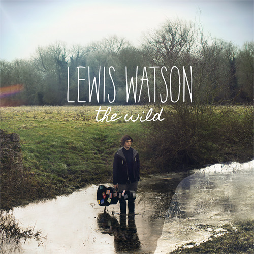
During my planning and research I looked at lots of different album covers, and an artist that I used as inspiration, called Lewis Watson has some perfect examples of how my album cover does use conventions of a real media product.
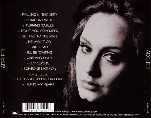
Back of album My Album back cover also uses conventions of a typical real media product. During my research I found lots of examples of real media products that follow a similar layout. This layout of a picture of the artist on one side and then the tracklist on the other is very popular.
This layout of a picture of the artist on one side and then the track-list on the other is very popular. It can be seen below on an very popular, well known album of Adele 21. This layout can be very effective as with an image of the artist it is more visually interesting and also helps to keep it related to the album and give the viewers more of an atmosphere and emphasis the theme.
I made sure that my Album back cover, included the website of the record label as well as the website for the album/artist. I also made sure that I numbered the tracks and that I put all less important information at the bottom left of my album in small font in order to allow the buyer to focus more on the track-list and the image. I also included the barcode in the bottom right corner in order to make it look more realistic and professional. CDI also tried to make my CD realistic and professional by following real media products conventions that I found during my research; for example, using a much simpler image that is not of the artist but that is still related to the album and with the synergy and the genre theme.
Inside booklet I challenged the conventions of a typical inside booklet by adding the web address to the bottom of the image. Although this goes against a normal inside booklet, it is not too distracting and my reasoning was because I felt that it would allow my audience to remember the website more and because my artist isn't very well known, hopefully they will benefit more from advertising their website so much.
Magazine advert Last year for AS Media, we had to study and then create a music magazine and because of this I think I have quite a good understanding of magazines. I knew about typical magazine conventions already and I knew what makes a successful magazine advert. I used my knowledge about layouts and fonts etc to my best ability to create my magazine advert. I created a double page spread advert that uses the 'facing-page' rule in order to grab the readers attention. I used the plain white text over the busy colourful background to allow the writing to stand out as it contains vital information.
2.How effective is the combination of your main product and ancillary texts? I think that my Music Video and my Digipak have lots of clear links between them all. I have used the same font and font colour across all of the Digipak. All of the photos used in my Digipak are also in my music video and therefor create a strong visual between the video and the ancillary texts.
Album front cover and magazine advert- 2:20
Album back cover - 0:16
Inside booklet - 0:47
CD cover - 0:04
Another element that I used to create strong synergy between the different parts of my Digipak is that I edited all the pictures with the same effect, Sepia. This creates a clear colour scheme and allows the viewers to notice the similarities between each part of the Digipak. Another link is that I feature in the album front cover, back cover and magazine advert and so this use of the same character creates a strong link. All of these links and uses of typical conventions has created a strong synergy between it all and this in turn then builds a strong marketing campaign for this album and this artist. It has helped to make my products look professional and more realistic. My aim in the video was to have natural love and to show a 'happy couple'. I believe that I achieved this and from the feedback I got from my friends and family, I am positive that they also got this message from my video.
I showed them the video and my ancillary text and asked for positive and negative feedback and then asked them if and how they think the video and Digipak are linked, and these are the answers I got...
One of my favourite Digipaks that I found during my research that I think had a huge amount of synergy in was Gabrielle Aplins album - English Rain.
The Digipak features props that are used in the music video and there is a very clear colour scheme throughout the Digipak (black and white, with specific point of colour on the multi-coloured balloons/umbrella). From studying this Digipak in detail I was able to learn lots about what makes a successful marketing campaign and what elements make a good Digipak. In this example you can see the use of the same Font and layouts, a running colour scheme, a repetition of one character and the use of one location. I used some of these ideas of including things that are directly within the music video, running colour scheme, similar layouts throughout and repetition of the same character for my own Digipak in hope that it looks more professional.
3.What have you learned from your audience feedback?
I used audience feedback and opinions throughout my work and during my planning, with things such as what name to call to my artist, or what song to use for my video as well as which colour scheme they liked the most and which parts of the video I should use in my Digipak, etc etc. I think this had a huge influence on my work and allowed me to create work that was suited and liked by my target audience and made my work successful.
For my main audience feedback (post making the video) I contact some of my friends and family that fitted in my target audience on social media and sent them a link to my music video as well as sending them images of my Digipak and I asked them to simply give me some positive and some negative feedback about the video, as well as asking them how and if they thought that my Digipak linked with my music video.
From my results I have learnt that my themes of 'love', 'happiness' and 'natural and realistic love' were clearly passed through my work. It also clear to see that they were able to identify the links between my video and Digipak and that they thought they worked nicely, as well as the fact they were suitable for my target audience.
A lot of my feedback said that my video looked 'professional' and 'realistic' they also said that my use of natural, everyday things/scenes/locations helped to get across the idea of 'natural love'. they said the scenes and characters look 'happy'.
My improvements to make are 'the quality of the pictures in my Digipak' and 'include some slow motion scenes in order to contrast the fast forwarded scenes'. I agree with both of these improvements as I think it would have given my work a higher standard. I also wish I could have included one more scene, maybe a pillow fight with lots of real duck feathers, in order to break up the painting scenes even more as they could get a bit repetitive; I would also have liked to have got more clips of us shopping as I think the short few clips I did get worked very well and could have made my video more visually interesting. Maybe have had some scenes of us trying on funny hats, or sat in a coffee shop, just some more simple, natural scenes of us laughing and smiling and just being us. Another thing that I would change if I did it again, from a personal preference and not based on my feedback, is I think I should have started the video with Paddy turning the camera on, as this would linked nicely with him turning off the camera at the end; it would also be a good hook for the video as the first scene would be a close up of the artist and this would entice the audience/viewers in straight away. My last change would be adding in more effects like rewinds, or mirrored scenes, as this would make my video quite indie and visually engaging, however it could make my video look too 'dance' genre rather than acoustic and therefor it would have to be limited amounts. I used a rewind once in my video at 0:30 - 0:33 and I think it worked very well as the line in the lyrics was repeated and it gave more emphasis to the lyrics 'come on love, come on love', and this technique and its consequences could have been used at some other points in the video in order to enhance the meaning and the key themes at significant points in the video. 4. How did you use new media technologies in the construction and research, planning and evaluation stages?
Throughout my research, planning, construction and evaluation I used a variety of different media technology. YouTube played a huge part in my coursework as it gave me instant access to all kinds of different music videos from all genres. I used it to research lots of existing and popular music videos and analyse them. This allowed me to gather information and common features of successful music videos and then use these features in my own video in order to make it look more professional. I also was able to find some past A level attempts at a music video. This gave me some videos to compare and relate too in order to help plan and construct my own video. I also used YouTube to upload my final video.
I used a social media site called Pinterest in my research and planning to find inspiration for outfits for my characters as Pinterest is very 'current' but also 'indie' and this was something that really reflected my theme for my video and so by using Pinterest I hoped to find ideas that were inspirational and useful for my plans and reflected the look I was trying to go for. Here are my examples that I found on Pinterest:
Another social media site that I used for some 'indie' inspiration was Tumblr. Tumblr has a variety of different types of people that use it. One of which is the very 'individual' people that fit into my target audience. I decided to use Tumblr to gather key ideas.
I used tumblr to find some inspiration for my 'cute couple' scenes. I found lots of inspiration on there; including the idea of painting and cooking with each other that I then chose to use within my video. .
I also used Tumblr to help me gather ideas based on costume/my characters dress senses and styles. I created a large number of collages (that can be viewed on my planning and research blog) when creating my character and the vast majority of the pictures were found on tumblr. I used PicMonkey to edit my pictures. I am very familiar with this website and I find that it was the only website that allowed me to do all the different editing that I wanted in one place. I used it to adjust brightness, saturation, contrast, shadow enhancement, as well as adding a filter to all my pictures. Additionally I found that it had the biggest range of different filters to choose from and of which was all free. I also used PicMonkey to create the collages. I used Microsoft PowerPoint when creating my digipak.
I found that all the fonts and font effects were not very sufficient on any of my editing websites. I was able to change the colour and shade of the colour on PowerPoint, as well as adding a shadow to make the writing stand out more. It also gave me a much better variety of fonts and styles. I was able to change the size and placing of the text much easier and although it is thought off as a lower quality program, I think that it was the best software to use to create a more professional looking digipak. Adobe was one of the most important programs that I used for my project. I edited my whole music video on this software, including adding all effects such as black and white filters, as well as fast forwards and rewinds. I had never used this program before but I soon picked up how to use it. I used this software as I think that it gave my music video a much better and higher quality look to my music video; this was because it was a high tech program and therefor had all different tools on it in order to allow me to edit my video professionally. I learnt how to cut clips, edit other clips together, put filters on some clips, add music to clips, remove sound from the clips, speed up clips, add effects such as reverse, etc. I found Adobe Premiere Elements very easy to use, it was friendly and clear. It is a program that I plan to use in the near future for some coursework for another subject as I think that I am quite confident using it and it gives a better quality than other similar programs such as Windows Movie Maker.
 front cover
 back cover
 cd cover
 booklet
 magazine advert